Faber-Castell
In terms of general quality of their everyday retail products, I consider Faber-Castell to be the best pencils on the market. They pay attention to detail and consciously source for quality and sustainability, both for their brand and for wider social ends. On top of that, their pencils are a great value considering the quality you get without having to rely on gimmicky artificial scarcity tactics or manipulative marketing like we’ve seen with Blackwing and Caran d’Ache - both brands that carry great products but you feel a little dirty when you buy them.
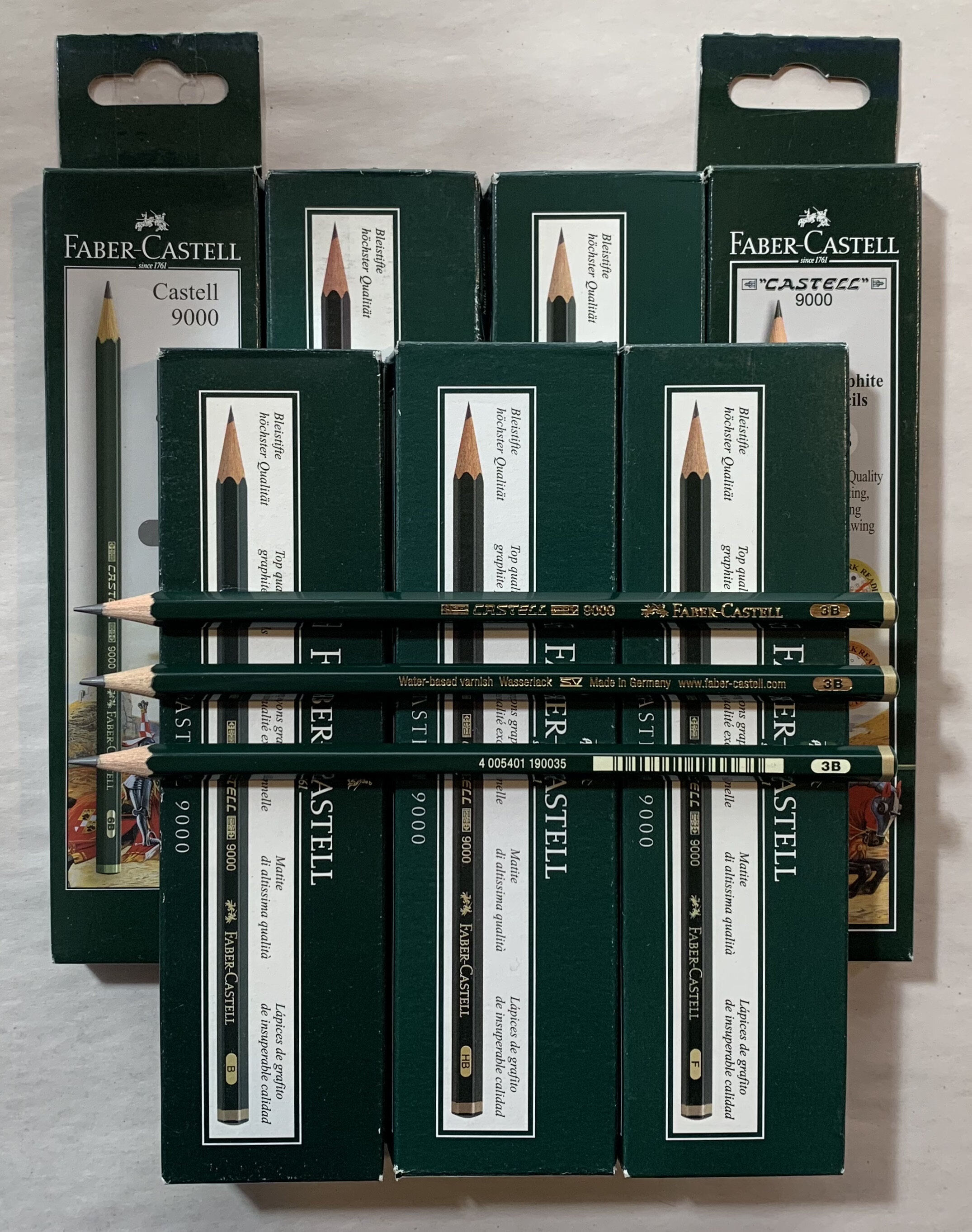
Their flagship pencil line is the Castell 9000, which were also the first ones I ever wrote with. The wood is heavier than average, sharpens easily even in cheap sharpeners, and has a hard, solid feel to it. This is aided by the heavy, glossy varnish they use in a rich dark forest green. The design is little changed in decades, and I even have a few specimens that look identical but are stamped “W. Germany.” The cores are smooth and dark but easy to erase. Like most European cores they run a bit hard, so I prefer the softer grades. 3B is my go-to for this line.

Similarly, the Dessin 2000 is little changed in many years. Lower cost but indistinguishable in quality, save perhaps for a thinner and cheaper varnish finish, the line vastly predates the year 2000, a number we’ll be returning to a few more times with this brand. The biggest thing differentiating this line from the others is its limited grades - only available in B and HB.
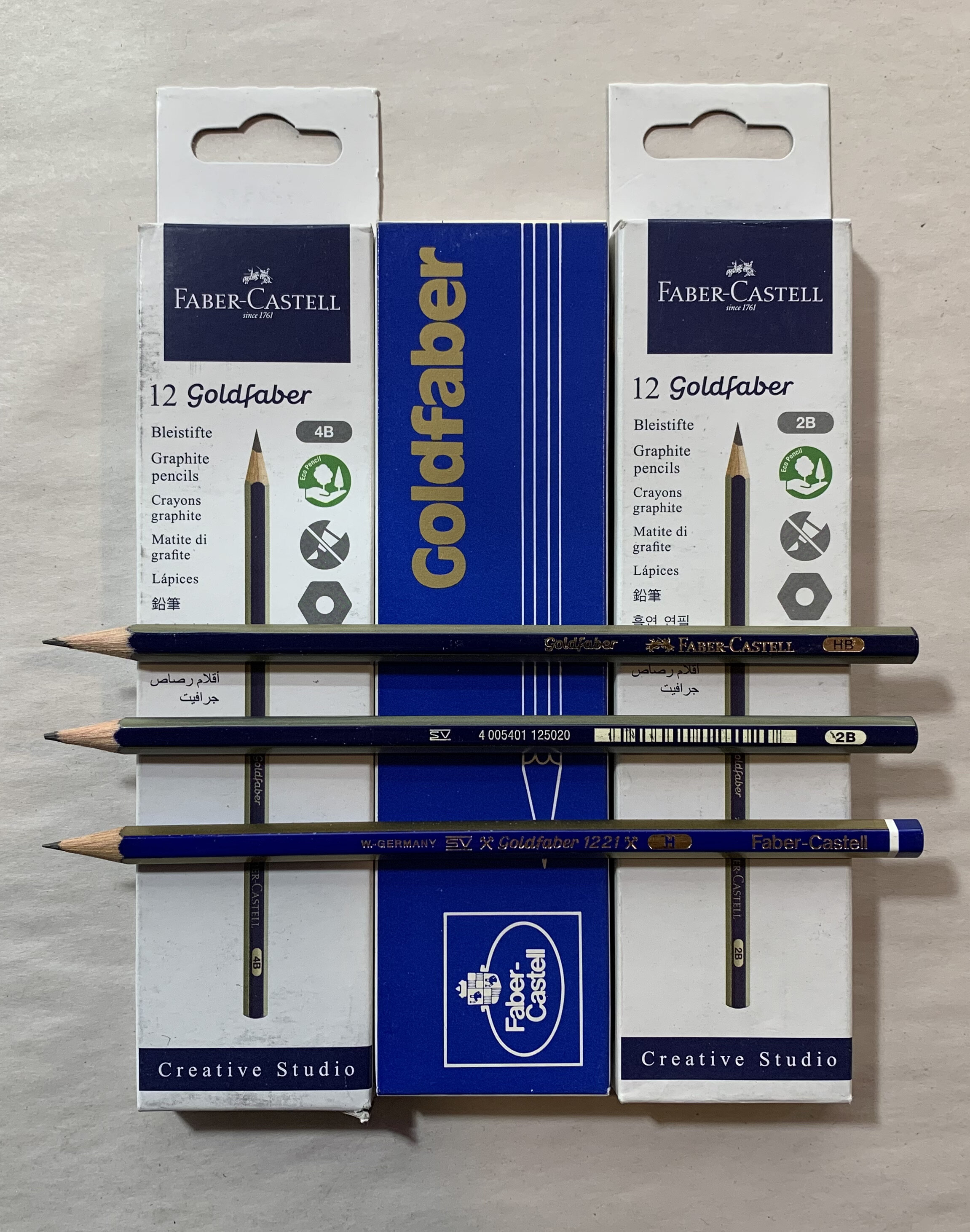
Even more identical to the Castell 9000 is the Goldfaber line. Here the varnish quality and design is very nearly the same, just with different colours, and with fewer graphite grades available. Like all Faber-Castell products, the varnish extends to the end-dip and includes foil stamping and logo. Like the other long-lived lines, you can find little-changed specimens stamped “W. Germany” if you look hard enough. One wonders if the varnish is a different colour or just faded or changed with the years.

More recently added to the brand and likely more popular in non-specialty retail are the Grip 2001 and Sparkle lines. In the case of the Grip, I do think they were actually first marketed in 2001, so this one makes a bit more sense. Stories tell us that the original Grip had convex rubber dots that were a bit too heat sensitive, and numerous customers were horrified when leaving a pack in their cars, only to return to a melted-together mass of slimy wood and rubber. These days, they appear to have perfected the formula and I have never experienced dot-failure, though if one tries hard enough the dots can be picked off if you’re an excessively fidgety type like me.
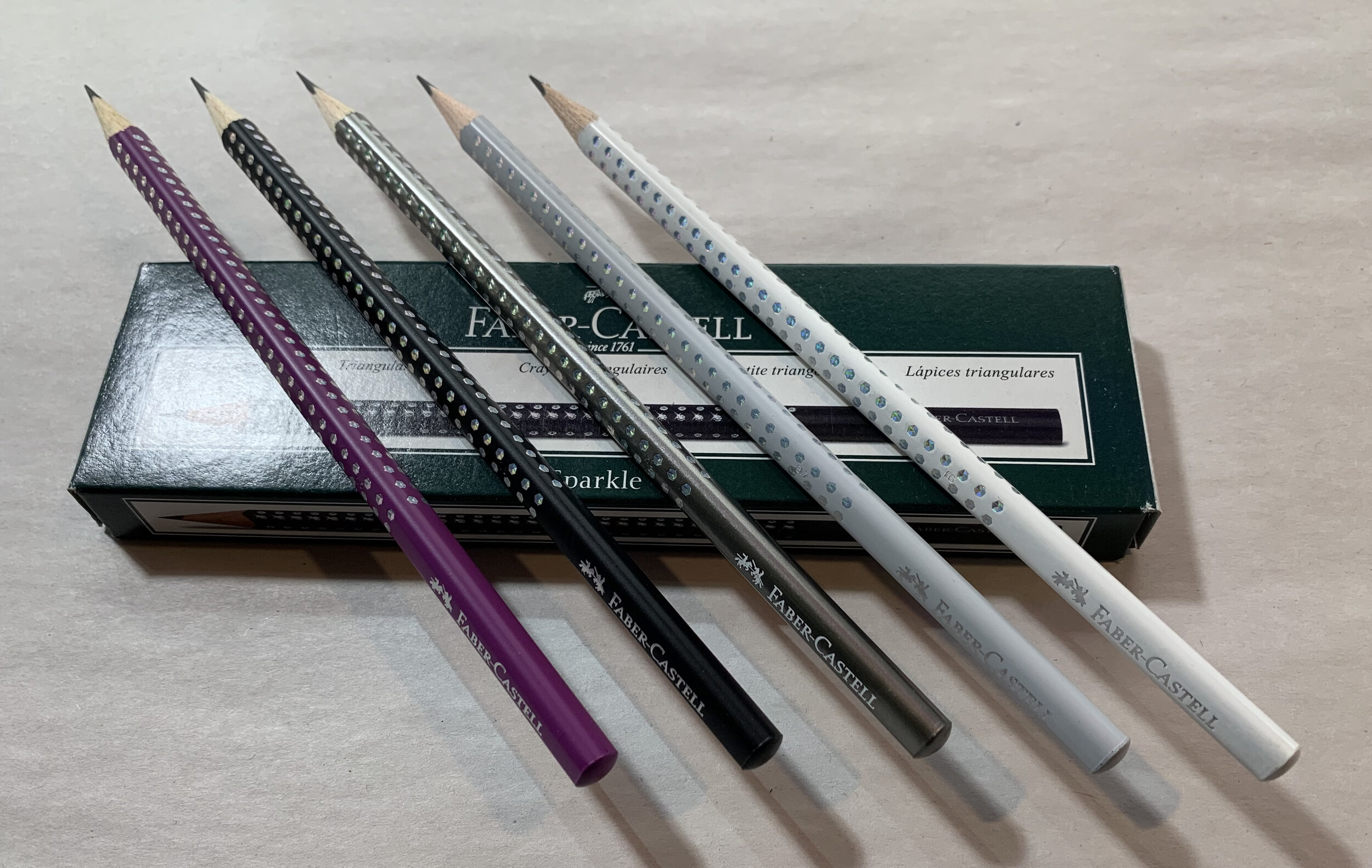
The Sparkle line is for all the little princesses out there. Identical to the Grip 2001, the triangular woodcases and smart textured lacquer are likely milled and applied in the same manufacturing line, except the sparkles have little concave holes carved into them, in which not a rubber dot but a holographic foil is applied to produce the “Sparkle” effect. Whilst I might sometimes complain about how stationery too often leans to the “girly” side, I still enjoy these, mainly because their aesthetic still conforms to the quality and utility I expect from Faber-Castell.

Faber-Castell does engage in the odd bit of limited edition capitalism, such as with the oddly magnetic round ribbed pencils, but this is not where they reserve their design and quality prowess. Instead, that prowess extends to all their products, not least their retail staples. Combined with a storied history spanning more than two centuries in Nuremberg, and they’re definitely one of the most enjoyable pencils to have and to use.
